Carmignac - Asset Management Website - Fund Pages
Challenge
Differentiate the product offering in a crowded market
For any asset manager, the key products are the funds they sell. This is no different for Carmignac, the boutique French asset manager. Competition is fierce and with so many asset managers and funds on the market, it is of vital importance to create an easy to use and differentiated experience that effectively tells the key product stories.
I designed the structure of the program and led the product and design teams to completely redesign the Carmignac fund pages.
What are the business problems we are trying to solve?
Interviews
My team and I conducted 21 interviews with team members from across the business. We spoke with the CXO, heads of Distribution (Sales), heads of countries, Wealth Management, Marketing, Fund Managers and Compliance.
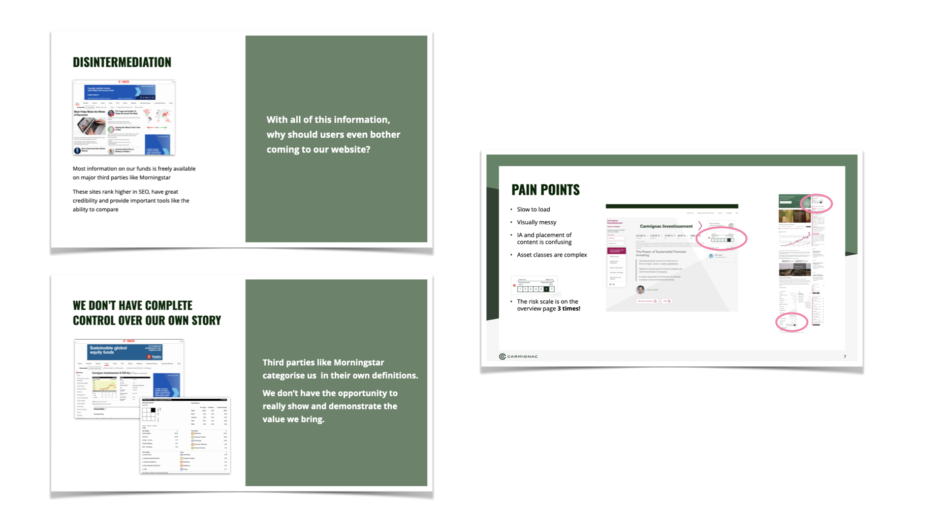
Through these interviews as well as expert analysis, we determined some key problems to solve:
Disintermediation: The fact that almost all fund information is already available on other platforms like Morningstar
Lack of control over our own story: Much of the narrative of Carmignac funds is created by media not in the control of Carmignac
Design and usability issues: Several issues with information architecture, visual hierarchies and more
User perceptions, competitors and areas to focus on - preparing for Sprint 0
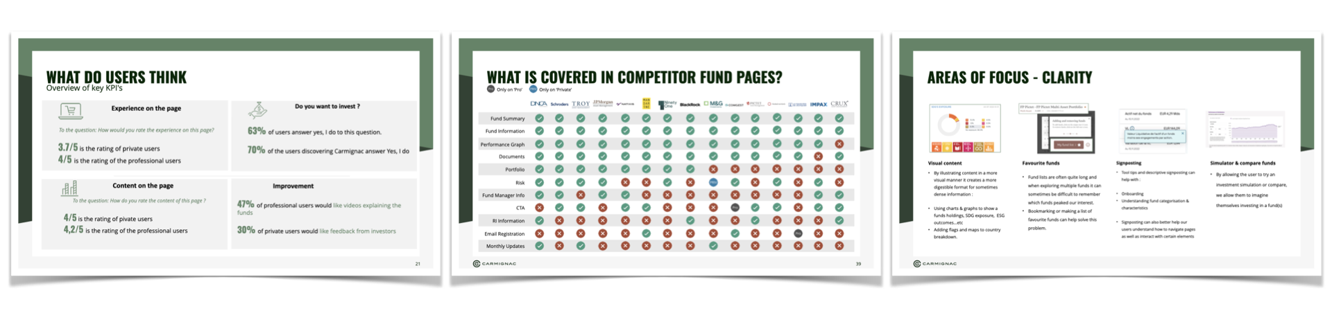
To set the team up for success, I decided we would begin the redesign effort with a Sprint 0. This would allow the design and product management teams to explore the problems in depth and ultimately provide clarity on the solution we would create going forward.
We brought together user perceptions of the current experience from Hotjar surveys, a thorough competitive benchmark (covering 15 asset managers) and a UX/UI audit to all serve as inputs into Sprint 0.
Sprint 0
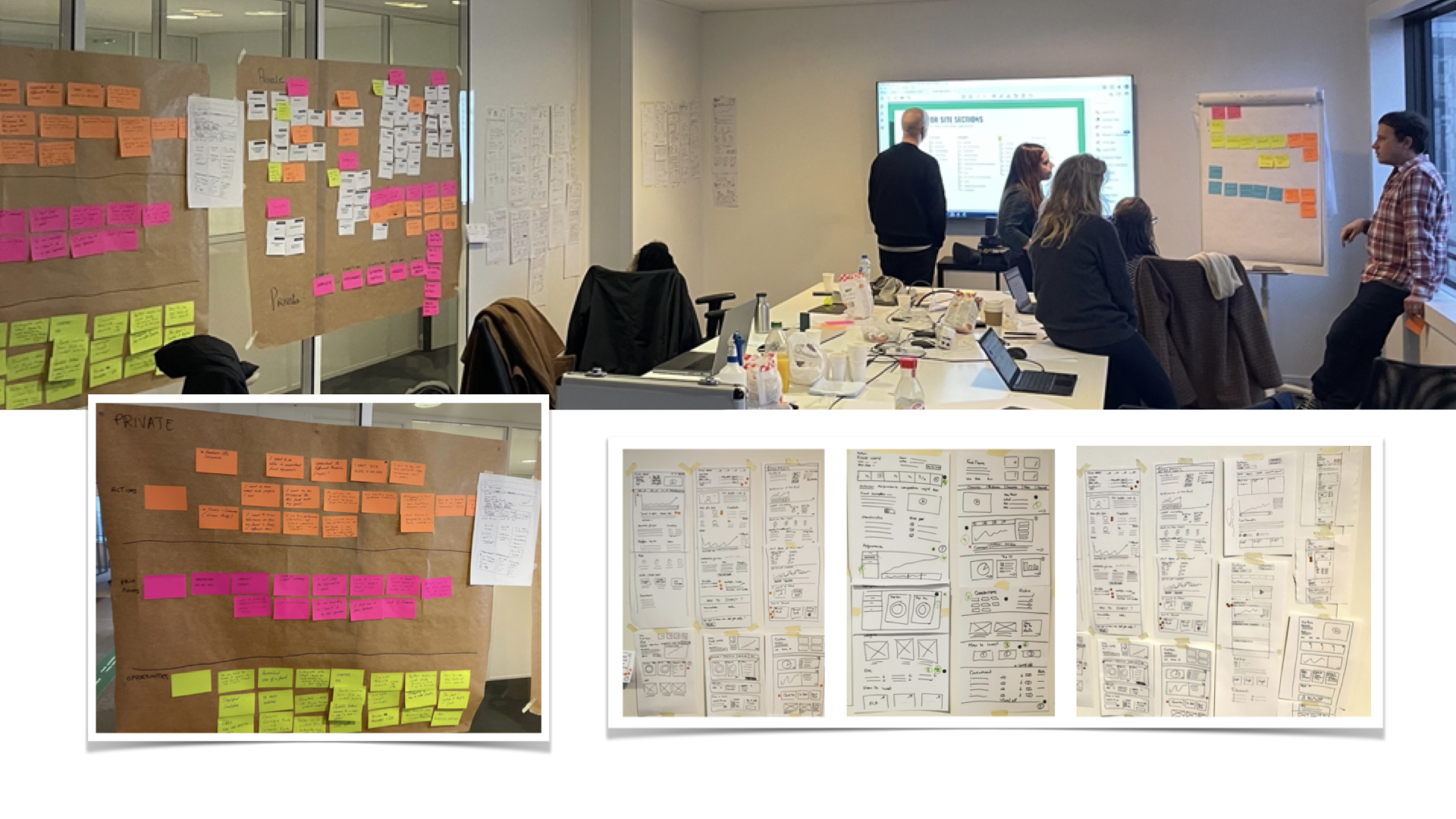
Sprint 0 involved members of the design (UX/UI) and product management and consisted of a range of activities including: user journey mapping, card sorting, sketching and defining the information architecture.
During Sprint 0, we addressed a wide range of problems identified in previous user research with professional (B2B) and private (B2C) clients, such as:
What is the strategy of this fund?
Where is it invested?
What is it invested in?
How does Carmignac think?
How can I easily share digestible content with end investors?
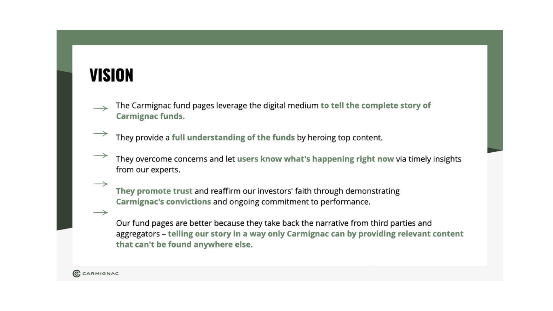
This was the first time Carmignac had ever used a Sprint 0 process and the phase was a success with the key outcomes being an agreed upon vision for the new experience, agreed upon high-level architecture for the professional and private versions of the fund pages and a committed timeline for the design process.
Sprint Planning
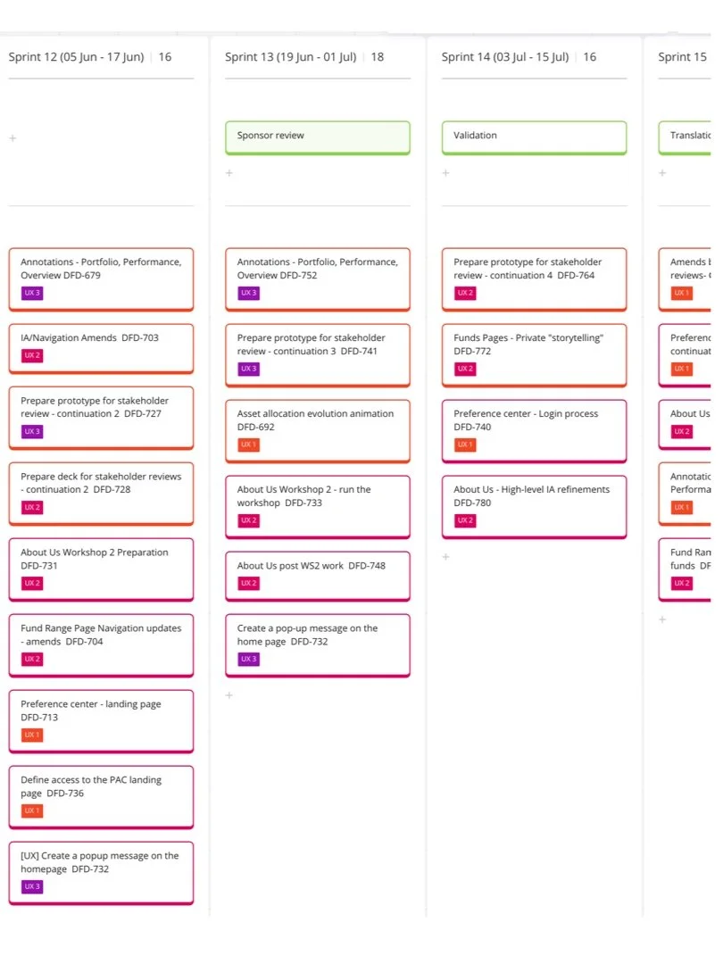
Owing to the complexity of the project and some resource challenges, I created the stories for and managed the design backlog (UX and UI) for the entire programme of work. I worked alongside product management to validate the backlog and ensure we were tracking to the roadmap and overall program timings.
Design, test, iterate
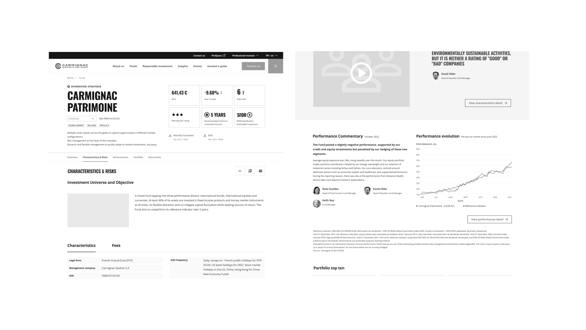
Wireframes were assembled in greyscale to ensure they were not confused with visual designs. Where possible, the wireframes made use of existing components from our design system to save time and ensure consistency.
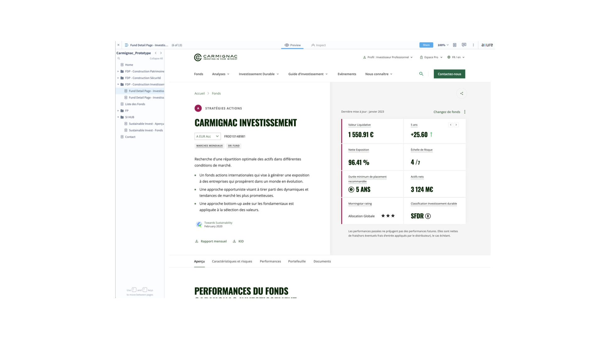
It was important to conduct user research on the proposed solution early. A functioning prototype was built in Axure (favoured for it’s more robust prototyping tools) and then evaluated with users in one-on-one sessions.
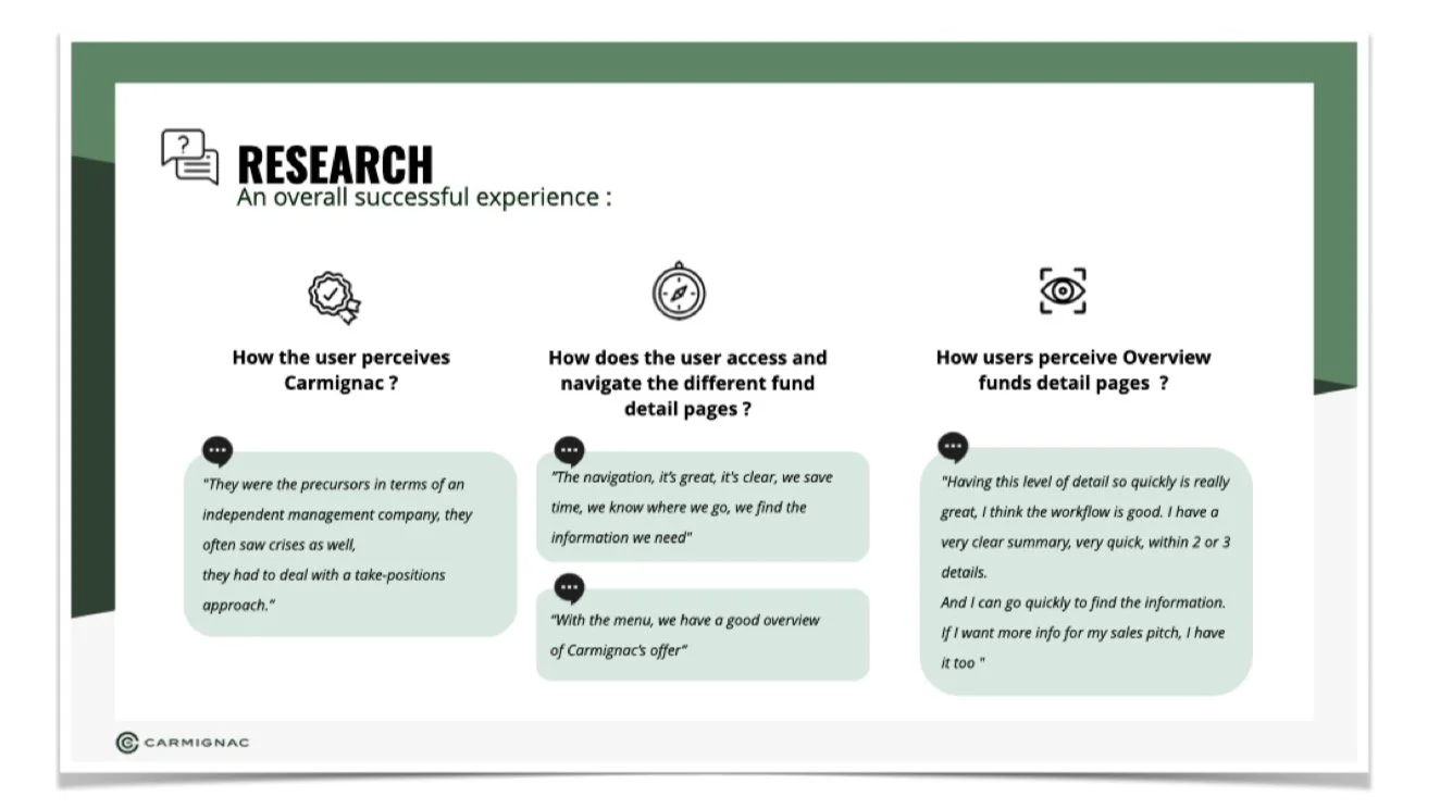
The sessions with users provided a great deal of valuable insights. Much of the overall solution was validated by users, but key areas in terms of nomenclature and content organisation were revised post-research.
The final solution
Redesigning the new fund pages was a daunting task, covering a total of 22 country/language variations across Europe. It required new data feeds to be created and integrated. Our development teams created an entirely new web application to support it and all front end components were built in ReactJS.
The final design provided compelling advances over the previous design, such as:
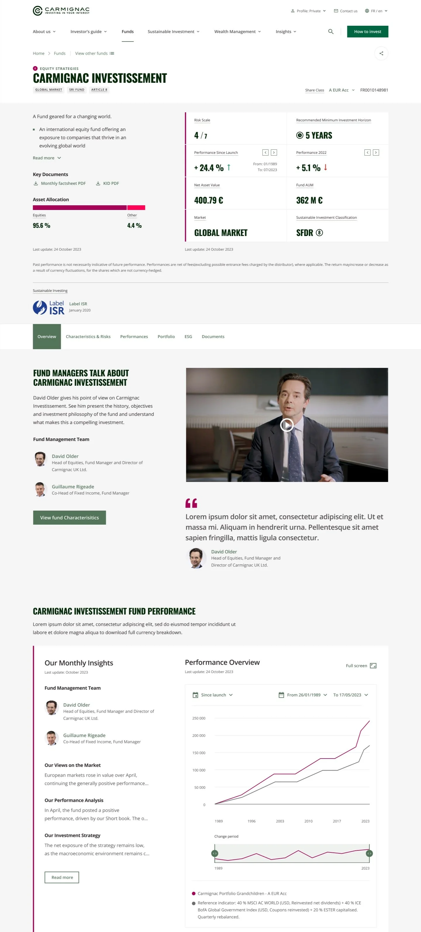
Essential information available at a glance: The page header contains all of the information that most users are looking for right away, including the overall asset allocation.
Easily accessible navigation: Detailed information on the fund is available via a single click from the internal menu. The menu follows users down the page as they scroll.
Humanised funds: The pages integrate videos of fund managers speaking about the fund’s strategy. Based on our Experience Principles, this puts the “human” face on the fund, allows users to better identify with the brand and provides easily shareable content.
Performance and insights: Performance information is accompanied by the regular fund manager comments, providing the context of the fund’s performance directly from the fund managers.
Easy access to ESG data: Funds that have a responsible investment ethos are becoming more and more popular. Almost all of Carmignac’s funds are responsibly invested and the final solution made this information prominent and accessible.